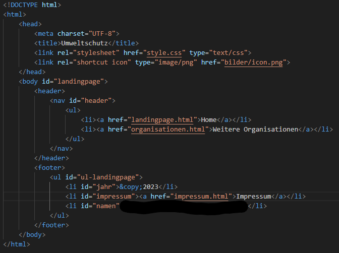
HTML text after background image?


Hello,
I have to program a simple website as homework and am encountering some difficulties.
Currently I have 4 main problems:
- My navigation bar in the header is not centered despite text-align: center
- I have "2023," "Imprint," and "Alex" in the footer. "Imprint" is a relative link to a separate page, and the other two words are just words. I managed to position "2023" on the left and "Alex" on the right, but I can't move the word "Imprint" with the link. It's fairly centered, but it's too high up in the footer itself, and I can't move it down.
- I've set a background image in CSS (so the entire screen is covered). Now I want to make it so that the background image is visible at the beginning, and only when scrolling down should the text appear after the image, instead of on the image itself.
- My footer stays in one position, just before the end of the background image. This means that as soon as I scroll, my footer would be in the middle of the page instead of at the very end. I've tried all sorts of position tags, but somehow it doesn't seem to work.
Does anyone here know a lot about this and can help me?
Thank you very much in advance.
Greetings Alex
 (1 rating, 1 votes, rated)
You need to be a registered member to rate this.
 Loading...
You can do this for the menu bar:
width: 100% and text-align: center for the wrapper. And then Max-width: 75rem and text-align: center for the actual menu.
In the footer-div you make a wrapper-div and write:
max-width: 65rem
display: flex; display: -webkit-flex
display: -moz-box
display: -ms-flexbox
flex-wrap: nowrap
flex-direction: row
justify-content: center
align-items: stretch
The three texts are then inserted into a div and then write in css for these divs:
text-align: center
I didn't understand that with the background picture. If you don't want the image to stretch over the whole page, you need to insert the image in html and not CSS. Then you can edit and move it more easily.
Just remove the background image and make it first that the page works.
Thanks for the answer. What are wrapper, webkit and the whole flex tags? We didn't have that in class. In addition, my teacher said we shouldn't use div containers because it would otherwise lead to a "div soup".
In the background picture it should be that you open the website and see the picture first. Then you should have to scroll down and as soon as the image stops the content (text etc.) should be displayed. I have already set the picture to no-repeat in CSS. When I insert it html, the problem is that it does not cover the whole side, but left and right, small white bars (also with width:100%)
A wrapper is just a div that ensures that your menu bar (or whatever) is correctly positioned and behaves properly and does not jump around anywhere. The actual menu then comes into its own div, which then takes over all other things. The rest doesn't matter.
I'm looking at the pictures you just put in.
Hello, I'm reporting again because I just got the results.
It became the full score and I could secure 20% extra points for the exam.
That's why a big thank you for all the help, because that wouldn't have been possible without you.
I was able to learn a lot and I am glad that I was allowed to take all this experience.
Thank you!
Alex
Yes, I thought it would appear in 3 html pages.
Your point makes more sense.
During this project, I noticed several times that my teacher somehow teaches it wrong, or I think it's smarter if he teaches it right now, instead of saying that one has done it in the past, and so we should learn it first and once we can, we should learn it as it is nowadays.
Well, you don't have to understand, but thank you for helping me. This has significantly facilitated the learning process.
Do you mean "top refers to 3 things" that it appears in 3 html pages? If so, there's nothing to do with it. Because there are many elements in the 3 html pages, the menu, the footer, etc.
It is much more about the elements repeating themselves on the same page – they would then be called "class", and elements that only happen once on the respective side are "id".
But: IDs are more rarely used, nowadays almost everything is about classes. And sometimes you even have no name, such as your text on the landing page, because the text sections are only called
, which is not wrong, because you can easily address them in css with "#content p {}" – then you can also see where they come from (namely from #content).
But, of course, do as your teacher wants.
Yeah, I think you're gonna get a good note now. The others certainly didn't go so much into detail.
I'm glad I could help.
If there's anything else, please register.
Hello, thanks for the tips and help.
Everything worked great.
I have now chosen the other js code and in this the distance to the footer slightly increased. As a result, the glitch is gone and the button does not stick directly to the footer.
On the organization side, I also added the old footer again, but given the whole organization div a margin-bottom. With this, the footer has no white surface under itself and the back to top button can remain.
This is still not the best solution I think, but it is a better option than the previous one.
So there is still no need to align the code. I still wanted to show you the website.
https://we.tl/t-hZq1UYqgu
But I would still have a question:
Are the code id and class correctly used everywhere? So it works everything, so this is not a big problem, but my teacher always meant id is for individual things that only happen once and class for several.
for example, I gave the body in each document the id top, but theoretically class would make more sense because "top" refers to 3 things and not only 1 (at least according to my teacher).
In the end, this is only an optical thing because the website works with all current id's and classes.
And again a great thank you for all the help you have given me for almost 2 months. I don't think I would have brought this website as far as you were, but I would have just got a very simple website with picture and text without any orientation.
Not only will I get a good grade for this, but I could also learn extremely much which will help me a lot for future projects.
So thank you for all your tips and tricks and all the time you have invested in this project!!!
Alex
1. The
Two. You have to write the js code in this function: "document.addEventListener("DOMContentLoaded", function(event { YOUR CODE HERE});"
You see that in the js file I created.
3. I have the code from stackoverflow. Two users posted codes. The one you have right now and the other is this: ( https://stackoverflow.com/questions/70240526/how-to-prevent-scroll-to-top-button-from-going-over-the-footer )
//Get the button
var mybutton = document.getElementById("backtotop");
// When the user scrolls down 20px from the top of the document, show the button
window.onscroll = function() {
scrollFunction()
};
function scrollFunction() {
if (document.body.scrollTop > 20 || document.documentElement.scrollTop > 20) {
mybutton.style.display = "block";
} else
mybutton.style.display = "none";
}
// check that button is not lower than footer.
let footerElement = document.getElementById('footer');
let footerElementRect = footerElement.getBoundingClientRect();
let mybuttonPositionBottom = mybutton.offsetTop + mybutton.offsetHeight;
if (footerElementRect.y < mybuttonPositionBottom) {
// if button is lower than footer.
// modify css bottom.
let diffheight = mybuttonPositionBottom – footerElementRect.y;
let style = window.getComputedStyle(mybutton);
addBottom = parseInt(style.getPropertyValue('bottom')) + diffheight;
mybutton.style.bottom = addBottom + 'px'; // maybe add more 10 px for bottom space of a button.
} else
// if button is higher than footer. this including scroll up.
// remove custom css bottom.
mybutton.style.bottom = ''
}
}
// When the user clicks on the button, scroll to the top of the document
function topFunction() {
document.body.scrollTop = 0;
document.documentElement.scrollTop = 0;
}
And the button sticks directly to the footer. You can try it out and play it a little bit.
4. That's because the code for the footer looks a little different. With margin you cannot really move the button. Otherwise I would have liked to see it, then I would have taken the second js code without the glitch, and then the button would have moved itself.
Five. In @media you only write the code that changes. All that remains the same is not coming in.
6. For this, there should be a function in every good code editor that automatically cleanses the code. Google after "align html code in …" and then with your editor, eg Visual Studio.
https://we.tl/t-gCAEAFa66B
Your solution worked great thanks to you.
I have adapted a few little things and I am now happy with the result.
However, since there is still a little time to pay, there would be some small things that I would change if you/I created them in time.
1. First a question: Why does the landing page of the footer tag lack and the div is still there?
2.) I once again tried to save the JavaScript code in an external file and link it to the head, but as soon as I do, the code no longer works with me. Do I need to link it somewhere else in the html code so it works?
3. Do you still have the page where you have the JavaScript code, or is it explained how to insert this distance between button and footer described by you so that it does not sometimes glitched over the footer? Then I'd try to fix it if I did it in time.
4. On the organizations page, the button always slides over the footer. I believe this is because I have moved the footer here with margin-top, or the footer has its own id.
Do you have a simple solution how I can fix it? Otherwise, I would simply delete the button on the page because you do not need it here anyway. It only looks good when it is on each side.
5.) If I use @media then I always have to take over the entire CSS code or if I only take over the days I want to change? Relationally, problems can occur if I only take individual days? I have the feeling that it would be so small mistakes that you have to look for eternity and just because you want to save a few lines of code.
6. My teacher said he cares that the HTML code has been inserted cleanly everywhere, ie div tags, which are already in a higher-level div, are moved further to "inside" and that is always the case.
Due to the many back and forth new insertion of new things, a few days are no longer cleanly engaged. That is why my question is whether there is a simple method to clean this up, or I have to correctly align every single line here by hand?
Thanks again for your help and especially your time.
Also thank you for your tip with the color for the imprint text, which I didn't notice so directly, but this has made the whole thing much better!
As I said, I am as happy as the website is now, and all the problems I have mentioned above are still extras, which are also only changed if that fits all in time.
https://we.tl/t-hWAaCV0pbj
Alex
Very simple solution. I added the same imprint text in html before the footer and then in css @media ( MIN -width: 1600px) and set the entire text to "display: none;". So if the page is 1600 px wide, then you do not see the new text below and if the page becomes smaller, then the "display:none;" if away and the text appears. You just have to issue the old text when the new one appears.
I would still consider whether I might not make the old imprint text white because the black font behind the gray background is hard to read.
I don't have so much time tomorrow, but I'm sure I can check in again today.
https://we.tl/t-xBcT06dct1
Thank you for your help.
Everything worked.
I changed a few things:
1. I changed the back to top button easily in html, as it had a white edge and, whatever, it didn't work with me. Now everything goes.
2.) The footer is now no longer fixed due to the problem you described. Instead, the footer of the organizations side now has a margin-top, so you have to scroll down about the same distance as on the imprint page. Otherwise, the footer was too far up with me and under this was still free surface to the end of the side.
This is definitely not the most beautiful and best option, but it does its purpose and a better way has not come to me for the quick.
3. To move the div for the scroll down button has worked. This also works perfectly.
4. With @media, I've set a few small things and that's all right.
Only in case of a problem I can't go on/may it somehow be solved, but I don't like it as an "emergency solution".
In CSS you can see that I tried to move the imprint text as I described it in the last message.
This has worked so a bit, but at some point the text is too far down/has too much distance up, the smaller the screen becomes, and the footer is above the text instead.
I have just learned that the levy is on 20.12 at 23:00 and that's why I wanted to pray for this last favor and ask if you find a quick, better solution for this problem than I do.
The screen size chosen by me at @media can remain and the plan is that the imprint text then looks like the text on the landing page.
So top header and background image, then the imprint text just below and at the end of the page of the footer.
I hope it's still possible for you in time. Of course, I can't ask you to take a vacation to complete this website. If you already know until Wednesday morning that this won't happen in time, just leave. Then I do the best out of this problem, and it's so good with the knowledge I have.
Maybe it's just enough if you know a solution and tell them briefly in a few sentences, then I can try to implement it.
As I said, I could take a lot of you and I'm very grateful for that. This small problem with the imprint page is also only still mugs at a high level.
I would like to thank you in advance, if it should somehow work and thank you again for all the help you have done to me up here!!
https://we.tl/tj1LoqMNWz
Alex
1. For the backtotop button, I took a little javascript code from the internet. Sometimes it glitches unfortunately and the button jumps to the end of the page, but usually it works.
I had found another code, so that this error does not occur, but at which the button always sticks right up on the footer and I didn't get on the quick that between Footer and Button is a distance.
Two. It is always only scrolled to the target object and you can move it. Maybe you can try to move the target object in CSS down or up. You can also use "outline: solid 1px red;" or write in html for a short time to see where #target is located.
3. You can use the "z-index" in the #imprint text, then the footer will be above the text and the background image. You can still scroll because the text now slides under the footer. The other option would only be that you push the logo on the background image upwards and then the copyright text.
With the fixed footer, however, you generally have to be very careful. On the organization side you see that there are some problems when you make the page narrower or wide. The content then goes over either the footer or if you make it smaller, then a very large white space is created between the pictures and the footer (just like on the imprint page).
4.1 I wrote you an @media code in CSS and removed the sd button there. Once you see it, you immediately know how it works. The button is simply set to "display: none;" for smaller sizes. So just fade out.
4.2.2. You can also move the backtotop button with @media if it is still not right.
4.3. Yes, you can also move it with @media. There are no limits on what to do.
Five. The problem here goes a little deeper. Since Edge has a strip on the right and above but is slightly narrower than Chrome, the background image is shifted.
The easiest thing would be if you just pushed the copyright text down – for all browsers. Then he looks normal again in Edge.
But you have often seen that there are many problems with the alignment of your text (relative to the logo). For the next time, you could just try to make the background in CSS gray and then place the logo in the middle as an image. Then you just have to worry about the div in the middle instead of the browser trying to work with the complete picture.
I hope you could take a lot of knowledge here – you're sure! For a first website this is already very good and you have got a lot of things you would learn a lot later.
https://we.tl/t-8f1d0OvJU
Hello, thank you.
The whole thing worked in any case, and I just improved little things on the sytling. So the website is almost finished.
But there are still a few very small things that are high-level stools, but since the levy is only next week, you can still improve them and get the last point out.
1. Can you set the Back to Top button from the position so that it is down, but still stops before the footer? Currently, I set this one so that it is in the right position at the end of the page and is placed something above the footer. The only problem here is that the button, as long as you don't see the footer, is too far up. But if I pushed him down, he'd be above the footer in the end.
So the button should be further down, but as soon as you arrive at the end of the page before the footer stop and be in the position in which it is up to date.
2.) Scrolling down with the button now works perfectly. Thank you.
Is there any way to adjust how much is scrolled? At present, after scrolling, you can still see a thin gray stripe from the background image. It should therefore scroll so far that it is at the border of the background image and the white surface.
3. I have now adapted the footer so that it is only fixed at the imprint and organization page. On the imprint page, however, you can still scroll (because the background image is too large). Is there a code in CSS here to block scrolling for the imprint page or do I have to make the background picture smaller here?
4. I tried various screen sizes of mobile phones etc. with the console in the browser and I noticed 3 things that you would have to do "responsive". But the majority already fits as he is (for my task).
Since the page does not have to be fully responsive, it is enough to improve these small things individually instead of making everything responsive. So that is enough to ensure that the website meets the task. In addition, the levy is next week (20.12), so it is enough to improve only the 3 small things.
Unfortunately, I don't know myself very well with @media, but I have a few approaches to these problems and maybe you can tell me if they work that way.
4.1.) On the landing page, smaller screen sizes of the scroll down button are shifted. Since you don't need this on mobile phones, etc., I think the best option is to remove this from a certain screen size (I think tablet size).
Can I do this with @media and then remove the sd button from this specific screen size?
4.2.) The Back to Top Button can remain with smaller screens, but from a certain screen size it is too far right and has no distance to the edge. Do I have to move it to the left with @media?
4.3. On the imprint page, the whole text is moved over the logo on the background image when the screen becomes too small. Can I use @media to somehow move the text under the background image if a certain screen size is reached (this should be the z-index that puts the text on the picture if I understood it correctly. Then you could simply remove it)? The text should then be displayed as on the landing page under the background. That's the best option.
5.) The author text on the imprint page is at Edge in a good position between logo and footer. On Chrome and Firefox, however, this looks a little squeezed. That's the fixed footer I'd like to keep.
Do you know a way to handle this?
I'm just thinking: don't make footer fixed, reduce logo font size on the background image or adjust the width of the author text.
These are all as I said, but small things that do not appear at first glance and just get the certain extra out. But since the levy is only in a week, I think you can at least try to improve these details.
I hope that there will be no mistakes after that by adding new code.
I thank you again in advance and hope that this last little step will also get a solution and we (or rather you) can complete the website.
I have only started this website with the absolute basic knowledge and have already learned a lot of helpful things through you. So even if there are still mistakes left at the end, I have at least consecrated my knowledge.
Thank you for that!
https://we.tl/t-iOxCzj6N7T
Alex
To your new message:
(1) If the background image is removed, then only #orga remains and this has a position "absolute" and a "top" value in css. That's why all your content disappears. As already said, position: absolute; not a nice solution, because there are often problems later. But without the background picture we do not need a position: absolute; more.
The footer can be brought down if you simply do "position: fixed;" and then "top" and "bottom" on 0.
If you don't want the footer to be constantly visible, you need to give the #orga up a little more space and up and down (padding) to close this gap to the footer. (Background color is just set on green so you can see that.)
2) So that you don't scroll down so far, you have to give the "#target object" to an empty div that you place in CSS a little further up. Look where I placed him in html and what code he got in CSS. That's all self-explanatory.
The whole responsive line can settle later when the rest fits. As said, the elements ALWAYS are displayed smaller when the page is called on on a smaller device. But only if the x AND y axis is reduced. If the side is only horizontally dipped, then of course nothing should happen. I don't think your teacher really wants you to, but just think that the elements shouldn't get out of the side if you make the window smaller.
Everything else would be a complete disaster and you should never learn or get used to it.
If you want to do this, you can always use "position: absolute;" then the elements will stick in their place.
But as said: "position: absolute;" one will almost never use in reality and one should rather learn to position the elements differently.
https://we.tl/t-yGTeh3lEdM
To your old message:
2) The sd button now works again. I just took the code from earlier, because I had already programmed it so that it works properly.
By the way, you should always create backups with date, then you can always go back and see how it looked earlier than it still worked.
3) Here it is enough to give the pictures simply a width with a percentage. h1 and h3 have a "vw" function as font-size. That's similar to percent.
But this is only to enjoy with caution – on a real website one would not work with such relative values. Because the images are displayed so or so smaller on a smaller screen. You'll see that you'll get a large white area under your website if you make the window smaller. Therefore, the elements should not be smaller if the window is only horizontally compressed. But I'm doing this for the job.
4)
can be used quietly. It would be best if you tried to bypass them, but this is not so important.
5) In the #kontakt-wrapper you can simply put "justify-content" on "center", then the contact details come together, and then you can "gap: 15rem" the way you want.
Place elements in the middle (as you want with the author text) you can always use "margin: 0 auto;". The "display: flex;" I used to get rid of it because you don't really need it.
However, consider that "margin: 0 car;" no longer works when your element has a "position: absolute;".
If you want a block set, you can do it with "text-align: justify;".
6) In Edge, the page is so far left because the browser has a bar on the right side. Each page is automatically moved to the left. So it's all right.
Hello, I'll get back to you.
I added the whole content (text) on the landing page today, and I noticed even more small things when I wanted to change something in styling.
1. On the organization side, I have inverted the middle image color and want to remove the background image so that the 3 images are on a white surface.
But if I remove the background div, the footer slips under the header. I don't really understand why this is happening. Can you somehow couple the footer to the lower end of the site so that you can see header, the pictures and the footer all together on the organization side? So you should see everything without scrolling
2.) When I added the content on the landing page and was able to use the Scroll Down button correctly for the first time, I noticed that it works, but scrolls too far. In fact, it should only be scrolled to such an extent that the heading "Renewable energies" remains to be seen.
I tried to make things with an extra div instead of taking the h1 as a target object, but that didn't work.
3. I packed the content into a div and adapted it into CSS. I've just moved this to the eye with margin-left. Is there a better option to get the whole text block perfectly in the middle, instead of working in the eye?
The text should best be in one block. So as I described it in the last message at the author's text.
And I have another addition to the last message.
I think that's how you understand what I meant to be linked to the background and shrink together.
You can imagine this:
You take the website and have moved on this all content, images and buttons so that they look visually good and lie in the right places. Then you make a screenshot of the entire website and this image is then virtually the website (so regarding the aspect of uniform shrinking).
The website should therefore behave like an image that shrinks when the page is smaller and logically everything that is on the picture (ie the content, buttons etc.) also. Just that it is not an image, but the right website where the content then also has functions, such as links, etc.
Whether these functions are too small after shrinking to be able to operate them well is no matter.
I hope with this comparison you could understand the whole thing a little better/easier.
The current website with content etc. now looks like: https://we.tl/t-4ywzpvs6uP
Now the website is content and finished from look. These small bugs are missing, which must be removed.
I thank you again for all your time and work you have invested.
Love
Alex
So hello, I'll get back to you.
So slowly but surely the strongest problems have been resolved and I have only noticed a few smaller ones, which only give me the last 1 to 2 points in the delivery.
1. I solved the problem with the button to scroll down. I had used the same id both in the div and the img. I've removed one of them, and there's no more 2nd box.
2.) There is now a new problem with the button. All the way he moves and disappears when you reduce the side.
This is a problem that occurs with most other content in different forms. At the end of this message you will see a paragraph in which I will describe how to solve the problem for all these content (believe and hope at least).
3. The images and headlines on the organizations website are no longer smaller when you reduce the page.
4. The 4
on the imprint page are indispensable, as I understood, or? I think this is also changed/resolved when you read the last paragraph.
5.) On the imprint page, I have now as ordered the text as I would like. There are now only 2 small styling aspects.
My question is whether one can reduce the distance between the contact data in the contact wrapper itself? I think if the two parts are closer together, it would look better.
And two, I want to put the author's text in a block. I mean, I want the line breaks that I have inserted HTML to remain, but the whole text is supposed to be a rectangular block (similar to a block set with Word) so that one line does not go over the whole screen, but is the whole readable one.
I've got all this with width:50% (I don't think I'm the most beautiful solution for it) and moved it to an eye with left:31rem. Is there a more accurate alternative?
6. If you look at the page like this (best in Edge, then you understand better what I mean), then you probably also see that it is not centered.
I have eg scrolled down the button and centered the author's text to an eye dimension (have oriented me on the logo of my screen, which, measured, is Mitig) and under this aspect you can see that the imprint link in the footer is too far left, the background image I also believe and probably also the whole page.
I don't know where it comes from or if it's at Edge, but in Firefox the problem is also there, but not as strong as Edge. In Firefox, the imprint link in the footer is also further left than the middle, but by far not as far as edge. In the pictures on the organizations page too.
And now the paragraph addressed:
I have learned today that my teacher is soft, that the page is not responsive, but that the content all shrink uniformly. That means what we have observed at the beginning (eg that the imprint text should be horizontal to be able to read it better if you reduce the page, etc.) is actually no matter. It is about the fact that the content on the pages is quasi coupled to the background.
Says: Whether you can still read the text in a reduced window or see the scroll button is no matter. It is important that everything there is content is coupled to the background and with this shrink. Texts and images should therefore be proportional to the background.
For my understanding, this can solve some of the above problems. At least I hope so.
https://we.tl/t-HS1rjINXXw
Love
Alex
Okay, thank you.
I'll try it out tonight. Hopefully it works with the javascript file.
Where that comes with the scroll down button, I can't really explain. From the old version, so the one you sent me before, I actually only moved the button in the position. I'll take a look.
1. The gap on the imprint page is the background (so body). Such small mistakes can always be checked quickly when you change the background color at body. I always leave my background color on red, then I immediately see if a gap is created somewhere.
Since all pages have the same CSS, it must be something in html. And in this case it is the
"Imprint". I just placed it downstairs in the code, so after the background picture. And then in css the height still adjusted.
2. Yep. This is all with a flexbox. You should get that. It's hard for me to imagine where you want to have what text, but it's only technically possible.
3. I changed the code for the text again, html and CSS. Before that, the text ran out of the picture and you couldn't see if the page was made smaller. Now at least the text remains above the picture. Of course, however, the text still needs to be adjusted with @media so that it is not over the logo at some point and you can't read anything.
4. The -webkit should be directly under the flexbox code. As I said, you can actually leave it because everything works anyway. And at some point, you have to try out the page on multiple browsers and grudges anyway. Then you'll see possible mistakes.
Five. The problem has now been solved with the new html code for the background image. I believe this was due to that
, because it automatically comes with certain properties such as line height, font size, etc.
The only distance that's still here comes from padding-top and bottom.
6. The linking in html thus looks like ""
The button to scroll down does not work properly. Make a "* {outline: solid 1px red;}", then you see that a box appears again above the button. It wasn't like that in the old version.
The more code we write now, the more can also get broken and the more difficult it becomes to find a solution because everything builds on one another. But you only learn this with the time you write it so that everything works well.
https://we.tl/t-jWuDvc69mh
Okay, I've taken the whole thing over and transferred header, footer, etc. to the other codes so that you can better see the overall picture.
The "Imprint" fits so far, I've already moved it a little, and I'll take care of it soon. Unfortunately, I don't have time for it today.
But I noticed a few little things that I wanted to clear out of the way before I left.
1. On the imprint page, I noticed a gap between the background image and the header. So you can roll something up.
I couldn't find out what this is about. The move of "Imprint" has not changed anything about it, and I also see in the code no margin or padding tags that could trigger it.
2.) For the text on the imprint page I thought again and came to the following idea:
Imprint remains in the middle (as it is currently set), among which the word "contact information" is to be used in the middle and then the names etc. These should then be next to each other, as the images on the organizations side (also with a flexbox or?). And the text on copyright should then stand individually, according to the font on the background image, so that you don't have to scroll. So you should see the entire text when you get to the page and the footer only when you scroll down.
My plan would have been to move "contact information" as it was done with "imprint". I would make the 2 contact data into a Flexbox (like the images of the Orga page) and the author text again according to the principle of "Imprint".
Is this possible or problems arise?
3. I have moved the whole text with position absolute so that it is on the background image with #impressum-text (it is still from the very beginning). With position relative, the text gets under the background picture. Is there a solution with position:relative? Since you think you shouldn't use position:absolute best.
4. I've added the webkit to #header nav again. My question is if I'd rather add it to CSS at html so that it's effective for the whole code. That's what it should just count for the header, right?
5.) On the home page, the "Renewable Energy:" is a gap between the background. I'd like to make this smaller, but don't find any margin padding or margin padding tag that causes it. I think it's just as similar as if you forgot a semi-colon somewhere and now look for years until you find it.
6. How do I get the javascript code into an external file? When I create a .js file and insert it into the head in html with, it no longer works that the button is displayed after scrolling.
As I said, I think most of these are small things again, and I am looking for the needle in the haystack and overlooking what is right in front of my eyes.
I hope you can help me again and thank me before hand.
https://we.tl/t-SJr5S393og
Alex
All right, thank you, I'll try it all out.
I have already noticed that the code in different browsers looks slightly different. I'll see if the -webkit etc. improves the whole thing.
The javascript code is of course great.
Thank you
1. The btt button is out of the footer now. Is quiet in the
Two. Making the header asymmetrical is easy. Now it is 4rm to the right, because the gap is also exactly 4rm large between them, and now this size is exactly right. The code is for #header with "padding-left: 5rem; padding-right: 1rem;". If you want to have it centered again, instead of padding-left/right you do "padding: 0 2.5rem;" as before.
3. You can see the code to place "Imprint" above the picture. Hope that's what you wanted. I don't know how you wanted to place the text. Maybe also on the picture like imprint, just below. As it goes, you can see the other elements that are above the picture. So with "position: relative."
"position: absolute;" you should try to avoid if possible. In general, I would always try to arrange things with one another instead of one another, because it is quickly complicated and can break a lot, and quite strangely shifts when the page is to become responsive.
After all, this comes to you anyway, because most websites call on mobile devices.
Sometimes you see this -webkit or -moz, this is just for the code also working on other browsers. Meanwhile, this is not necessarily necessary because almost everything works everywhere, but does not bother when it is there.
You should also try to see if the page is running on different browsers, because it can be that a specific CSS code does not work because it joined later, like flexbox.
The two heights at the header are a mistake, I deleted the upper one. The CSS code is always read from top to bottom, so I removed the top because it wasn't active.
Sometimes you really need to think about what's up and what's down there, because sometimes you need to write a code that depends on what was before.
That's why it's always like sizes and positions to the top.
https://we.tl/t-DtS2vJv1SL
Okay, I've taken over everything and changed something myself.
I've got some little problems again.
1. Because the back to top button is now in the footer, it is too thick for my taste. Is there a way to place it outside of the footer so that it is down in the right corner, but not in the footer and stays there? I can only place the button there, but as soon as the screen gets smaller, it slips over the footer which shouldn't happen.
In addition, when the screen is reduced, the button is only imaged halfway or only halfway visible (in width)
2.) The header works so far, but is not really centered or centered. I have an idea here where I don't know how and how to implement them.
Due to the fact that the 2 pages have different long words, you can center them, but it does not look centered. That's why I thought you could take the gap between the 2 side left and center the middle of this gap. So the distance to the left and right wouldn't be the same, but maybe it looks better?
Is that okay? Or is there another solution so that the whole thing is not only centered (as now) but also looks like that?
3. I have already changed the text in the imprint a little to continue working with it.
What is my plan here is to center the Worft "Imprint" between header and the "AXAN" from the background image and then place the rest under the font from the background. I would then also make the contact data in a Flexbox next to each other (as with the images on the organization page) and below the text.
Here I only need your help, as I get the word "imprint" as centered as I want. Or is the best option here to move the whole thing with percentages until it looks centered in the eye?
Besides, I would have two more general questions about the code:
1. At the header in CSS you used display: -webkit-flex etc. What exactly is that for? I deleted it from the code and didn't notice any difference.
2.) At Header nav in CSS there are two heights. One of the two can be deleted or? Or the 2nd because always the first value is taken as far as I know.
I hope you can help me again with your knowledge and tell me if my approaches are possible and how to implement them.
https://we.tl/tKkOeJq7Np8
Thank you and greetings
Alex
Thank you very much. I'll try the next day.
I'll adjust the imprint so that it's horizontal.
I'm currently at all these little players because the page is almost finished, except for the content on the home page. Since I have a few more weeks for the levies, I just add those little things that were not required, but round off the whole picture again.
Your project with the imprint text that shrinks with the image will not work. Here you can see what it looks like when the window shrinks to 480 pixels (so a quarter of a 1,920 pixel monitor): . You can't read anything. It's just too much vertical text. Better if the text was horizontal.
1. The code from the imprint could have just been downloaded and then exchanged. I did this almost. But "Impress" is still right in the middle. Your circle to scroll down is just too far right.
Two. The menu bar should now work perfectly. See the CSS code of .header-wrapper, .header, .header nav and .header nav a. Maybe you don't understand it right now, but in any case it works and you can also use it for later projects.
3. The scroll down button is now coupled to the image. You can also copy the code for the imprint page.
4. Button to scroll up now also works. Of course, he has to be much smaller because he's disturbing and standing above the name.
From now on, I would not program such little things and focus on the big and whole. Such buttons for scrolling up and down are only necessary for very large websites.
https://we.tl/t-1NI4MLfw1a
Hello, again.
I've taken over everything, again expanded/changed a few small things and bump again on small mistakes.
Maybe in my deed, I have somehow changed some code, deleted or changed important/needed lines code, which resulted in these errors, but I cannot locate them.
The problems are:
1. The words in the footer are now all again placed in one line and centrally, only the imprint link is too far left. I can't explain why.
2.) In the header, the 2 side links are currently not in one line, which makes the header look a little big. In CSS, I reduce the boxes that I put around the words, then the links are in one line, but also do not seem to be centered or the distance between them is too large.
In addition, if you make the website smaller, the distance is completely missing between the two links.
3. I have also inserted the Scroll Down button with an image and moved to the desired position. That works great too.
However, here is the problem that the image is not coupled to the background. This means that if the side is smaller, the image is not smaller and remains through the predetermined position becomes at the lower end of the side and not at the lower end of the background image.
The same problem applies to the eagles on the organization page and the text on the imprint page.
In addition, the two sides show that the text remains firm when scrolling, which leads to the header slipping during scrolling. would slide over everything that is displayed on the content page.
4. The Back to Top Button has now also got the desired position and the problem of the fixed position also occurs. The image should remain above the footer and come after the content.
When making the side smaller, it remains at the bottom right instead of staying above the footer.
The footer should therefore be at the end of the website, but also not like the header have a fixed position.
This means the image of the button, should also shrink with the side and almost remain at the end of the page, above the footer, right in the corner when the page becomes smaller.
At present, the problem also arises that the image from the button on the smaller the site can only be seen halfway, instead of completely.
I believe that I am facing rather minor problems, but I do not yet know enough to get to the right solution.
I've already tried to solve the problems with what I've learned, and I'll get this to some extent, but then, through my way of solving, there are new problems that I can't solve again.
That's why I hope you can help me again and thank you very much.
You've always helped me very well so far, and I was able to learn a lot more about what my teacher couldn't teach me.
https://we.tl/t-6NxAlVORgo
Alex
All right, thank you. That makes sense, was easy to understand.
I'll take care of everything once I get home.
But I noticed one thing before:
I usually put the text on the imprint page on the background picture and it will be smaller if I make the page smaller. However, the problem here is that everything shrinks, but independently of one another. The text has its fixed font size, so it does not remain on the background image when the page becomes smaller, but the image becomes smaller, but the text then stands on the whole height of the page instead of staying on the background image.
Can you achieve this with position: fixed or is there a type of code that converts the fontsize into a percentage value?
Thank you for your help and greetings
Alex
At the footer I removed the "text-align: center;" the year. Now the distance left and right is the same. "Imprint" remains in the middle, but if the page becomes smaller, then the year and name comes closer to the middle and then you realize that the distance from year to imprint is greater than from name to imprint.
But you can't prevent it, otherwise you should change the distance left and right again.
The Flexbox on the "Organization" page works now. See how the divs are created and what you need in html. This is often always the same scheme: only in general a div with ".org" where everything comes in and then a "wrapper" which sets the functions, eg "margin: 0 car;" so that it is centered (blue box), and so on…
The images you used should have the same size in the best case, either all square or at least the same width.
The fact that the images are to be smaller when the screen shrinks already works automatically. But before that, the elements are first drawn together, so they come closer together, which is also correct. So it all works as it should.
To optimize the page for mobile devices, you will need to add an @media query later. A new CSS code is then written when the page becomes, for example, smaller than 750px. Then, for example, elements that are displayed next to one another are displayed, because there is often no space on mobile devices to position things next to one another. But you don't have to.
You can easily change the backtotop image in CSS with these commands (just select what you need)
.backtotop:hover {
filter: saturate(3);
filter: grayscale(100%);
filter: contrast(160%);
filter: brightness(0.25);
filter: blur(3px);
filter: invert(100%);
filter: sepia(100%);
filter: hue-rotate(180deg);
filter: opacity(50%);
}
The one with scrolling and that the button should only be displayed afterwards and disappear again with javascript. I don't know if it was possible with CSS. If, then it's probably very complicated. I also doubt that you need this for the task. But these are also more things you need when the page is really extremely long. I would first make sure that the page works well from scratch and has no mistakes before I make such "games" and animations. Because as you can see, you're already busy with the simple things.
https://we.tl/t-eLXH2HBgX
Hello, I just created the back to top button according to the principle of your scroll down button and added a screenshot of the old button (which is in the code I sent you).
Is there a way that I can give this picture a different color when I go over with the mouse? With :hover, it doesn't work with me.
And then there is the possibility that I can only display the image from the button if you have scrolled at least 1 times and as soon as you are back at the beginning of the page, should the button not be displayed again?
The code for this is what I currently designed:

♪ Backtotop ♪
position: fixed;
top: 90%;
left: 95%;
}
#btt-button {
width: 4rem;
height: 4rem;
}
Alex
Hello, I didn't have time to try the whole thing. I've taken over this whole thing now, and I've also expanded something myself and it's all right.
I only have two minor problems now:
1. By the fact that the year, name and imprint now have a box around itself and the name was written in 2 lines (has been too long), then the year and the imprint link were no longer centered (up and down). I simply made the box bigger for this, which also only partially solved it.
It is then necessary that the year has much greater distance to the left edge than the name to the right edge. In addition, the name is written again in 2 rows when pulling/smaller, whereby the rest is no longer aligned upwards and downwards centrally. (The same problem also occurs in the header).
How can I fix it?
2.) On the other organizations page I have inserted pictures and saved them with a link. I've taken the principle from the box for this, but unfortunately it doesn't work that way.
The picture to the right is too far to the right, so you have to scroll to the right to see it completely. It shouldn't be like that in the best case.
Added to this is that the images when pulling/smacking the page, eventually overlap (I think that's because I gave them a size of 17rem, which is good on Full Screen, but no longer on smaller screen. The pictures also unfortunately all have a different initial size, which is why I don't know what the best option is here).
Is it possible here that the images decrease percentage by size with reducing the screen? And can I somehow couple this to the associated headings (climate protection, water protection, nature protection)? So, on the one hand, the headlines are placed centrally over the pictures (not even distributed over the screen with a Flexbox as with me) and also shrunk together with pictures when the screen is reduced (but still remain centrally over it)?
According to my teacher, nothing has to be done in full responsive here, but it is enough if bidlers etc. are given in percentage values, etc., and it is virtually reduced/degreeded proportional to the screen.
I have also uploaded the new code to you here again, as it now has many new names etc.
And do not wonder that background image has been changed and will be adjusted again in height. But I don't think this should be a problem for the rest of the code.
The Back to Top button, you will see here (but I will probably still do it according to the same principle as the Scroll Down button). I have to style both buttons.
https://we.tl/t-zwt6HOa8FB
Thank you very much
Alex
Oh, I understand, that makes sense, I guess I'm not enough in the subject to know that.
Thank you for your help. I'll try it out.
https://we.tl/t-NI0OBWoJGH
#imprint is now in the middle. For this I simply gave the three elements a width (width: 10rem) so that they all have their own box and then centered them in their box with "text-align:center".
To use the width "rem" is very important here because with px or % the boxes are oriented to the entire document and with rem they are dependent on the text – so if the page becomes smaller (responsive), then the text does not go beyond the box because the box is always larger than the text. With width: 10% the box would become smaller and "Imprint" would no longer be centered from a certain point and flow out of the box.
Here's the code:
#year, #imprint, #name {
outline: solid 2px red;
width: 10rem;
text-align: center;
}
For the back-to-top button, I lack the HTML code, but actually you don't have to make it that it only appears after scrolling, because a scroll button isn't visible anyway if you haven't arrived down. And if you see it from the beginning, it's unnecessary because you don't need to scroll so much.
Otherwise you can look at something like this: " https://stackoverflow.com/questions/61246614/make-element-visible-only-if-scrolled-down-or-page-higher-than-only-video-css- " or with javascript: " https://css-tricks.com/how-to-make-an-unobtrusive-scroll-to-topbutton/ "
For the scroll button with which you scroll down, I wrote a few code lines. It's a bit more difficult. The idea is that the scroll button is simply a link ( ), but with "href" there is no website, but an ID or class that appears below in the document. Thus, with the link " Springs down " you jump to the code at the bottom"
". So at href stands "#target object", and that is exactly the ID of the DIV at the bottom to which you should jump.
In CSS you have to write "html {scroll-behavior: smooth;}" so that the jumping is liquid -> so a normal scrolling.
But in order for the link to be on the picture, you have to write a little something in CSS. You can see this at "#background" and ".scroll-down". And the nav at the top has a "z-index: 999;" otherwise it would disappear through the new code from the background image.
You can then move and format the text at the "Springs down" base. And the whole
, you can of course also delete everything and also various.
On the other hand, where the text is to be on the picture, it works just as with "Springs down".
After I have taken over everything and easily adapted (colors etc), ask me again a few questions because I don't get any further in some places.
The first problem is that previously described that the imprint link is no longer centered as soon as I enter my full name, instead of just Alex.
The second problem is the Back to Top Button I mentioned earlier. I want this to be displayed only if you have also scrolled and not if you are already at the side catch (I have already sent the code for this)
The third problem: I want a scroll down button on the landing page, ie a button which is placed on the base of the light bulb and then brings me to the content when clicking (I need to add it and he would start right after the picture)
The fourth problem is that I want to have the text on the background on the 2 other pages and not only after scrolling.
I can only partially solve the problems, because it comes up to a certain point, but still something doesn't fit or works.
You know simple solutions for this and could possibly help me again.
I would be very happy and thank you very much.
Alex
I found out what the mistake is. If I change my name in the footer (I used only my first name instead of the whole name) then the whole thing slips to the left. How can I write my first and last name in here without that happening?
"Imprint" is right in the middle of my base. I remeasured with Photoshop and it fits perfectly.
So I took over and got the header. Thank you very much.
However, I still have the problem that the imprint link is not centrally under the base of the bulb. Is there any way the possibility to move the imprint link within the Flexbox so that it is centered?
Ah and I have the code for the Back to Top Button here:
.totopts {
position: fixed;
width: 50px;
height: 50px;
background-color: #585858;
bottom: 40px;
right: 50px;
text decoration: none;
text-align: center;
line-height: 50px;
color: #000000;
font-size: 20px;
}
.totopbts:hover {
background-color: #2E9AFE;
}
In HTML I added this via Font Awesome Link
Thank you. I'll take a look.
I just added a Back to Top Button with Font Awesome. This also works perfectly, but it can be seen throughout. Is there a kind of visibility tag or the like so that the button will not appear until the page has been scrolled?
https://we.tl/t-2KzHj2a6YN
(In CSS, the code is "outline: solid 1px blue;" so that you can see how the elements stand and what changes exactly when you write something about the code. If you don't need it anymore, you can delete it.)
In html I removed the ULs and ILs for the footer and made DIVs. A flexbox was then created in CSS. This solves a lot of problems at once.
With "display:flex" it becomes a flexbox. "flex-flow:nowrap" prevents the elements from jumping into a second line. With "justify-content: space-between" it is said that the elements are to be distributed across the entire width of the page. And the distance left and right comes from "width: 95%".
Then there was added "padding-top" and "padding-bottom" so that there is little space on top and bottom.
I didn't change the menu bar. You can do it yourself with the flexbox. This will be a little exercise for you. I've changed HTML, you just have to do CSS and follow the footer code. At "justfy-content" you can choose either "space-between", "space-around" or "space-evenly". Just try.
And from nav you can change the width if you want. She's 50% right now.
I didn't look at the pages "Further Organization" and "Imprint". Look that everything is important for the landing page, then you can easily copy the code. If the codes are exactly the same, everything will work there.
I also noticed that the picture is missing on the 2 further linked pages (further organizations and imprint). However, if I add it to html, the text is only after the picture. On these second pages I want the text on the picture. Should I determine the image in CSS as a background for the 2 websites?
Here I uploaded the files https://we.tl/t-HWvxUY882r
Give me your code. Put the html and css up somewhere and copy everything in here.
Hello, I'll get back to the website. Your code definitely worked and everything fits great.
But I have a little problem again. I have equipped the ul-landingpage li in CSS with a margin-top: 1.5rem so that the text is in the middle of the footer. The error has now occurred that the normal text is displayed in the middle, but the text from the link for the imprint is not. How can I fix it?
I also noticed that the text in the footer has a different distance from the edge. The 2023 has more distance left than the name right. What's that about? Can this be solved with the flexboxes?
And maybe there be a trick to see the picture in the middle? The text in the navigation bar is in the middle and in the footer the same, but it still looks like it's not in the middle. On the one hand, you can see that the Tetx in the header is not on the same line we are the imprint link in the footer and on the other hand the imprint link is not directly under the base of the light bulb, but on the left.
I hope you can help me again. I appreciate it.
Thank you for your help and time. It sounds plausible. Thanks also for the tip with the blue border. The flexboxes and the file I'll watch as soon as I'm on the PC. Thank you very much
Here is the html and css file: https://we.tl/t-X2i57fwbah
I moved the background image to html. It was in the day, now it is between
How did I remove the white frame around the background picture? A![]() always automatically has a space around itself. To get rid of it, the
always automatically has a space around itself. To get rid of it, the![]() must be converted into a kind of div element. This goes with "display:block". Then it behaves like a div. Now you can write a new code in CSS:
must be converted into a kind of div element. This goes with "display:block". Then it behaves like a div. Now you can write a new code in CSS:
♪
margin:0;
border: 1px solid blue;
}
This code means that ALL elements in the document, ie every img, every div, everything… no longer has a margin. So a margin of 0. This removes all spaces and gaps.
And another little tip if you have problems. Write in CSS in the "*" simply "border: 1px solid blue;" then EVERY element is marked blue and you can better see where the gaps come from, then you don't have to look for long.
You can actually remove the "id" from the (landing page) because body occurs only once; that doesn't need an ID. You can write "body" in CSS. Like "html"
Your menu bar is already centered; I didn't do that.
I pushed the text in the footer apart with "margin-left:20rem;". But the 20 rem from the first text (2023) removed again with "#ul-landingpage li:first-child: margin-left:0rem;". This is not a nice solution, but normally would not necessarily work with ul and li. There are better alternatives.
Look at flexbox https://css-tricks.com/snippets/css/a-guide-to-flexbox/. You can easily arrange elements. Of course, you have to understand it first, but if you can, it makes everything so much easier.
Okay, thank you very much
Okay, I'll try to write something on the code either today or tomorrow. If no one else answers here.
html
height: 100%;
font-family: arial, sans-serif;
}
/*
♪
background: url(images/background.jpg);
background-repeat: no-repeat;
width: 100%;
*/
Ing
width: 100%;
}
header
width: 100%;
height: 4rem;
text-align: center;
background-color: #c5c5c5;
position: fixed;
top: 0;
left: 0;
box-shadow: 0px 2px 5px grey;
}
a
color: #000000;
text decoration: none;
}
a:hover
color: blue;
}
nav ul
list-style-type: none;
margin-top: 1.5em;
}
♪
inline;
text-align: center;
margin-left: 25px;
}
footer {
width: 100%;
height: 4rem;
text-align: center;
background-color: #c5c5c5;
}
#ul-landingpage {
list-style-type: none;
}
#ul-landingpage li
inline;
text-align: center;
margin-top: 10px;
}
#year {
float: left;
margin-left: -30px;
color: #000000;
}
#imprint {
color: #000000;
}
#name {
float: right;
margin-right: 10px;
color: #000000;
}
♪
width: 29%;
}