Does the CV appear appealing and clear?
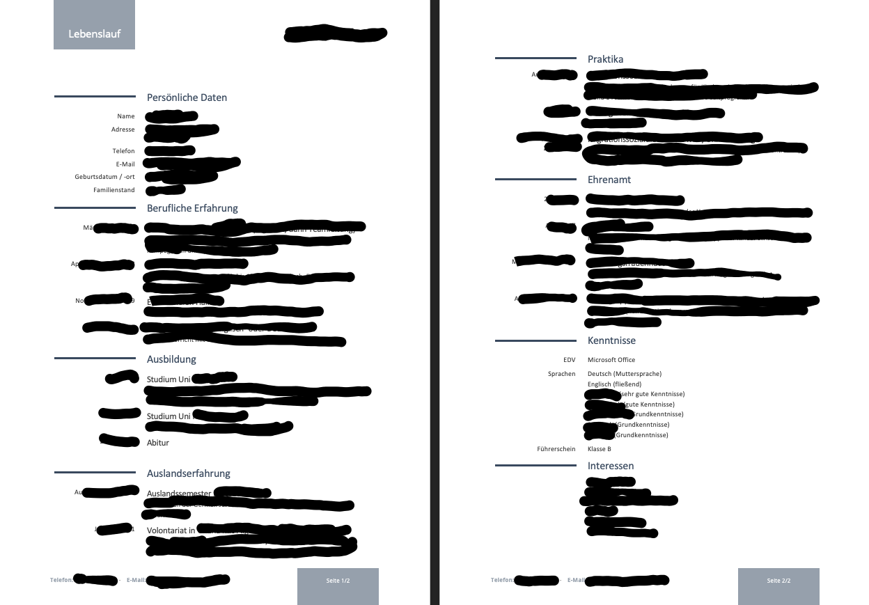
It's not about the content itself, but about the design, so I censored the content that could identify me.
The screenshot shows both sides. When printed, this would be one sheet with both front and back.
What can be improved in terms of design? The industry is education/integration/migration.
You need to be a registered member to rate this.
All right, an exemplary resume.
Wow. You can read the black?😂
If you mean the smear, of course not. We don't have to be able to read this right now, it's private. The structure fits.
Date of birth/Place of birth should come at position 2 according to your name, not first in the final position.
All in all, your resume is well and clearly arranged.
Hey.
You have a nice resume but I find it a bit too simple
You could change the colors a little and a photo is also very important
Otherwise, I can't complain because everything is necessary from content
Personally, I would share experience abroad on the 2nd page to exchange internships on the 1st page
I'm sure you'll have a lot of success and a lot of luck applying!!
Small amendment proposal:
What you do under "knowledge" belongs, as it is useful to the job, further forward (in any case before the honorary office, possibly also before the stay abroad) – the later something comes, the more unimportant it is perceived.
You can leave. For the job I find it right that you have summarized the two stations under experience abroad.
Wish you lots of success!
The design is 0815 standard from the net. Passport photo is missing. The rest doesn't tell me anything because everything's weakened. Others here can see more than I and interpret accordingly.
I find him – purely structural – really great!
That doesn't really read a mess. It is only important to look at professional experience and, if necessary, training.
Personal interests, if not direct relevance to the company or your future task.